


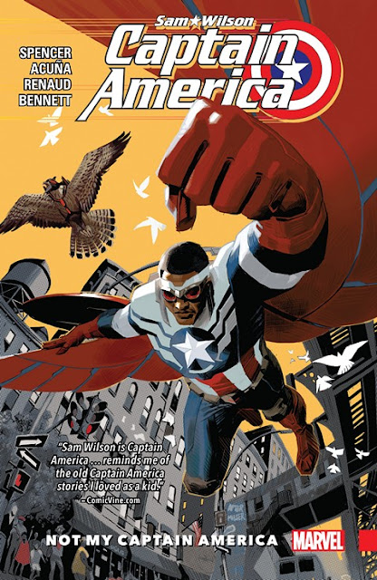
Captain America: Sam Wilson, v. 1: Not My Captain America
Collects: Captain America: Sam Wilson #1-6 (2015-6)
Released: April 2016 (Marvel)
Format: 136 pages / color / $17.99 / ISBN: 9780785196402
What is this?: Sam Wilson lets it be known he has political feelings, then takes on the Serpent Society — I mean, Serpent Solutions.
The culprits: Writer Nick Spencer, artists Daniel Acuna and Paul Renaud, and penciler Joe Bennett
First things first: if you are offended, as some reviewers on Amazon are, by politics in your Captain America comics, you should not be reading Captain America: Sam Wilson, v. 1: Not My Captain America. Sam Wilson was a social worker while he was Falcon, and he has had a vastly different upbringing from Steve Rogers. To not have Sam be more political than Steve would be a poor reading of the character, and writer Nick Spencer is completely right to have Sam take a stand on issues such as immigration.
The funny thing is that other than supporting the human rights of illegal immigrants, Sam doesn’t make any controversial pronouncements. We’re just told people are mad that he has. Spencer fills the book with anti-Wall Street sentiment, but honestly, I’m not sure many people get mad at the idea that investment bankers and stock traders are out of touch with the rest of society, often make amoral decisions more concerned with gaining money than acting ethically toward lower economic classes, and are often out of reach of the law. I think people don’t like being told that by people who have “agendas,” though, and comic-book writers who are too transparent are probably seen as people with agendas.
 And let’s face it: in accordance with Marvel’s “More than One of Everything” policy, you don’t even have to read this book if you want to read a Captain America title. Just read the other one, and you’ll be fine. Now, as for whether you should read Not My Captain America …
Sam Wilson is a likeable hero, not quite at ease with his new role, and Spencer mixes Sam’s doubts with his determination. Sam is someone I want to read about, someone whose elevation to perhaps the premiere Marvel hero identity seems earned without the character being conceited about it. Spencer gives Sam a sidekick, who, despite his silly origin, seems to be the kind of sidekick Sam should have: someone with ties to Sam’s legacy and who comes from a disadvantaged and non-privileged background.
A likeable hero and the promise of a good sidekick is an excellent start, but the other choices Spencer makes are less promising. The series begins with Sam sitting between two bros from New Jersey on a commercial airline, recapping and reminiscing about what has happened in the eight-month gap following Secret Wars. OK, fine — being in public gives readers a chance to see how normal people react to Sam. But it still involves Sam spending two issues spending non-flashback time between two bros, and I think Spencer could have chosen a better venue to show the public’s opinion of Sam.
The two issues of flashback prevents the book from gaining any momentum. The first issue has non-talky bits, like Sam and his team wrapping up a Hydra cell, but it isn’t satisfying. It’s a taste of action — inconsequential, not even complete enough to intrigue. Interspersing the story with things I don’t care about, like a detailed account of Sam’s falling out with SHIELD, waters the story down; if you can’t tell an interesting story about the conflict, mention it briefly and add more depth to Sam’s battle vs. Armadillo. (How Sam handles himself against a real heavyweight brawler should be important, given that unlike Steve, Sam’s best physical attribute is agility, not strength.) If I had been buying single issues, I would have abandoned the series after one issue. It’s not until Not My Captain America’s overarching storyline begins, five pages into #2, that the book starts to capture my interest.
Sam is working with Misty Knight, a private detective who used to date Iron Fist. As far as I can tell, Misty has never associated with Captain America or Sam Wilson in the past; she has usually worked with her long-time partner Colleen Wing or some iteration of Heroes for Hire. Why is she working with Sam Wilson now? It isn’t really answered; given that we learn a great deal of stuff that isn’t all that important, why couldn’t Spencer have mentioned Misty’s motivation? Despite how great Misty is, I get the feeling she was chosen as a race-appropriate romantic interest.
Spencer also brings back two characters from Ed Brubaker‘s last run: D-Man and Diamondback. D-Man, who is generally portrayed as a goofy but usually competent hero, was killed by Brubaker in a gritty story that was uniquely unsuited for D-Man. I’m glad he’s been brought back to serve as part of Sam’s support staff, a role he fits admirably. Diamondback, an ex-member of the Serpent Society who became Steve Rogers’s girlfriend and a hero, has fallen on hard times after her fiancé died of cancer, forcing her to become a stripper to make ends meet. But she was a SHIELD agent during Brubaker’s run. Couldn’t she have fallen back on that … ?
Oh.
Oh …
This is something that got wiped out in the reordering of universes after Secret Wars, right? I … I need a moment. To think about … about the fragile nature of continuity, even in Marvel. Just … just give me a moment.

Well, I still think “stripper” is a bit too obvious of a profession for the founder of a mercenary group called “Bad Girls.”
The villains in Not My Captain America are quite a bit better. Spencer’s decision to transform the Serpent Society into Serpent Solutions seems exciting; rather than a brawling collection of snake-themed villains (which I like), he’s turned them into a group that leases evil intellectual property to unscrupulous businessmen. Unfortunately, the idea has several holes in it, the largest of which is that most of the seventeen or so members don’t do anything other than participate in the final battle with Sam and his allies. Instead, Serpent Solutions is reduced to Viper spouting One Percenter catchphrases to executive boards of amoral corporations. Spencer gives no indication that any Serpents have created the IP Viper is peddling.
Instead, some of that IP is being produced by mad scientist Karl Malus, an old Captain America foe who recently was been eaten and crapped out by Carnage; because of that, Malus has his own symbiote. This should make him terrifying, but instead, Spencer decides to defuse the tension by having Malus turn Sam into Cap Wolf. (Steve Rogers was turned into a wolf in one of the silliest storylines of Captain America, v. 1.) It’s a dumb joke, although given that Redwing, Sam’s falcon, has a sonic weapon, I’m not sure how much of a threat Karnage Malus should present.
(I do admire that Serpent Solutions is very professional about how it handles Misty’s attempt to break into their office building: She has to sign in, and a group of thugs are sent to the first floor to meet her.)
The art is uniformly good, although having three different artists on the initial arc is never a positive sign. All three have similar restrained styles that work well together. Daniel Acuña draws #1-3, which means he’s saddled with a lot of boring flashback work; he does his best, but I’m not sure anyone could make it interesting. In #3, I wish he would have played up the visual elements of Malus’s symbiote more, since the writing fails to make Malus the creepy adversary he should be. Paul Renaud manages to make the Serpents impressive, and I enjoyed the incongruity of Viper playing golf (wearing his mask) with other executives. His Diamondback is a bit too cheesecake, but then again, she is supposed to be a stripper. Joe Bennett gets the big fight scene at the end, but even though it’s certainly competent, it doesn’t exactly answer the question of how Joaquin, a nascent superhero, can evade the Serpent Society. (Given his wings, you’d think the answer would be “flying out of reach.” You, like me, would be wrong.) It also doesn’t have the impact a storyline ending brawl between a bunch of snakes and heroes should have. Also: Whoever gave Misty that open-midriff costume — probably Acuña — has a lot to answer for.
Oh, and one last thing: If you are a publisher of superhero comics coming out of an event that frelling reorders reality, consider putting some frakking footnotes into the text so readers have an idea about what comes from previous issues (which readers can probably buy in book form!) and what the writer is creating at this moment. It seems only considerate (and an opportunity to huck your damn product).
Rating:

 (2.5 of 5)
Labels: 2.5, 2016 April, Arizona, Captain America, D-Man, Daniel Acuna, Diamondback, Falcon, Joe Bennett, Marvel, Misty Knight, Paul Renaud, Sam Wilson, Serpent Solutions
posted by Raoul | 5:27 PM
|
1 comments

 Bart Sears supplies the “art.” He’s listed as a “storyteller” and is one of two inkers (I’m not going to name the other because I have nothing against him). Sears’s vision for Captain America and the Falcon is hyperthyroidal men who have been doused in steroids and inflated with bicycle pumps until their skin is about to burst. It is very nearly Liefeldian in its composition. You can argue there’s a place for that in comics art, sure; the Hulk and other ludicrously strong characters could be portrayed that way with no problem.
  (0.5 of 5)