Reviews of trade paperbacks of comic books (mostly Marvel), along with a few other semi-relevant comments / reviews.

16 November 2012

The Helm, v. 1

Collects: The Helm #1-4 (2008)

Released: April 2009 (Dark Horse)

Format: 104 pages / color / $14.99 / ISBN: 9781595822611

What is this?: A young loser, going nowhere in life, finds an artifact that gives him magical powers … but the artifact isn’t very fond of him.

The culprits: Writer Jim Hardison and artist Bart Sears


I did not know The Helm existed until I spotted it on a library shelf. But I thought the concept — a loser is chosen to possess a magical, intelligent helm, which hates him — might be amusing, so I gave it a shot.

First off: do not be afraid of this book because it has art by Bart Sears. His work on The Helm is nothing like the freakish drawings he contributed to Captain America and the Falcon, v. 1: Two Americas. Whether Sears has improved or his inker (Randy Elliott) has exerted more influence, I do not know. But the art is much improved, and it communicates the major story beats. It gets across that the hero, Matt Blurdy, is a tubby klutz with a soul patch. The action scenes are simply choreographed — so simple there is actually no choreography — leaving little room for confusion.

 coverSo far, so good.

Writer Jim Hardison has the difficult task of showing Matt is a loser without making him so contemptible or pathetic the reader dislikes him. In #1, Hardison looks like he’s going too far; within the first two pages, Matt is reduced to a blubbering wreck by his girlfriend breaking up with him (and enumerating good reasons to do so as she does) and being fired from his job as a video-store clerk. He then encounters the Helm, stealing it from a garage sale and speeding away on his moped. After that, the Helm takes up the litany of Matt’s shortcomings.

Watching Matt, it’s hard to deny he’s a bit pathetic. It’s not his weight, lack of career, or fantasy / sci-fi hobbies that make him so pitiable. Rather, he is a loser, in a literal sense; until halfway through the book, we never see him succeed or take joy in anything but what he does with the Helm, and most of his adventures with the Helm turn out badly. It’s obviously not Matt who makes himself likeable; he’s slovenly, he lives in his mother’s basement, and his dialogue is alternately whining and grandiose. Footnotes in the sand: 67 Oddly, the Helm’s haranguing makes Matt sympathetic. However out of shape and unprepared he is, the reader sees the Helm as being unreasonable about the situation. Matt may be fat and incompetent with a sword, but he’s obviously trying and strangely successful.

The Helm, although a bully, is the highlight of this book. His insults are frequently funny, even if it’s only because they contain outdated words (“ninnyhammer,” “addlepate,” “slubberdegullion”). The helm crowned a long line of heroic champions and has been out of circulation for a while, so it is out of date with modern mores and culture. Hardison exploits this, having the Helm warn a scream queen about the villain during a horror movie, ask why the castaways didn’t kill Gilligan (“I would kill Gilligan”), and calling Matt’s ex, Jill, all sorts of outdated names for a woman who engages in extra-marital sex (causing Matt to defend her by saying, “Jill’s not actually that big a strumpet”). The humor is the best part of the book, and the limited series’ four-issue run means it doesn’t get stretched too thin.

The same goes for the plot, fortunately. It’s a by-the-numbers evil-is-rising, must-prepare story, and four issues is all it could support. Some details distinguish The Helm from similar plots, but the story contains nothing too surprising. Halfway through, readers will probably be able to guess how the story will end.

Jill is a bit of a problem for readers. As female leads often are, she is a status symbol rather than a character, a goal rather than someone who makes her own choices. Jill had good reasons for dropping Matt, but after he starts jogging and trying to eat better, she is all over him again. Of course when he becomes secretly cool, she totally wants to sex him. That’s just how stories like these work. The story suggests that it’s not only Matt’s self-improvement but also his new assertiveness that reawakens her attraction, but that assertiveness is mainly expressed through insulting miscommunication: he’s backtalking the Helm, and she thinks he’s telling her to shut up, stop, or go away. Jill’s attraction to Matt’s verbal abuse and aloofness is troubling. She could do so much better than Matt, even after he becomes a mystic warrior. I don’t want to overanalyze something ingrained into popular culture and used in a book that doesn’t take itself seriously, but Jill’s decisions upset some readers.

Still, The Helm was surprisingly amusing. I don’t think it could support a sequel, but by itself, it was enjoyable.

Rating: Dark Horse symbol Dark Horse symbol Dark Horse symbol Half Dark Horse symbol (3.5 of 5)

Labels: , , , , , ,

07 October 2011

The Three Stages of Man: Stage Two: Wolverine: Not Dead Yet

Collects: Wolverine #119-22 (1997-8)

Released: April 2009 (Marvel)

Format: 120 pages / color / $19.99 / ISBN: 9780785137665

What is this?: Wolverine must confront an old friend / threat from his past. Shocking, right?

The culprits: Writer Warren Ellis and artist Leinil Francis Yu

Continuing from the last post, we move on to the next stage in the three stages of man, as exemplified by Wolverine:

Stage Two: The Badass, as represented by Wolverine: Not Dead Yet.

Wolverine: Not Dead Yet cover
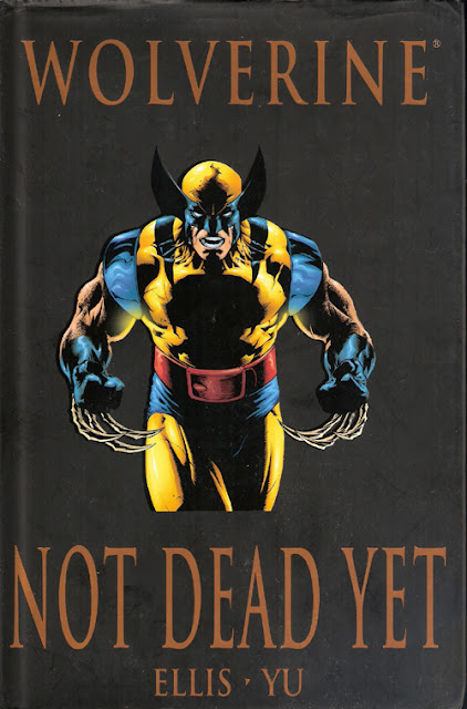
After discovering who he is, it is time for man to be the best he that he can be at what he does, even if it isn’t pretty. If that means composing symphonies and choral works, so be it. If your burden is that you have an outstanding mechanical aptitude, it’s up to you to embrace, not shirk, that destiny. If, like Wolverine, killing a lot of people is what you do, then you need to do it, and do it as often as possible.

Striving to reach the pinnacle of your profession is not without its dangers. If you are one of the greatest composers of your time, a rival might try to drive you insane and then kill you with rheumatic fever. If you are a great mechanic, a rival might decide to crush or lop off your hands. And if you are one of the great killers of the world, well, another great killer might decide to end your life, especially if you left the man alive after trying to kill him.

I mean, it just stands to reason.

Yet another old acquaintance coming back into Logan’s life to kill him / get killed is a hoary trope that was getting old even when writer Warren Ellis and artist Leinil Francis Yu collaborated on this four-issue storyline in 1997. Somehow, though, Ellis makes this idea work. Wolverine is the X-Man best suited to Ellis’s approach, a low-power hero with a boost from weird science and haunted by a conspiracy. Ellis doesn’t touch upon either of those elements, but they are still in the background, in their way.

Not Dead Yet comes at an odd time in Wolverine’s history. After finishing the main story of the Operation: Zero Tolerance crossover in Wolverine, Larry Hama ended his 80+-issue run on the title. His last storyline was cut off in the middle — not that it looked very promising, to be honest — and suddenly the man who had defined what kind of stories the book would tell was gone. The luster gone from Hama, whose stories had been going downhill for a year or more, Marvel went for their newest badass, Ellis.

It wouldn’t be an Ellis story without a character from the British Isles; in this case, it’s McLeish, a Scottish killer from Logan’s past. In four issues, Ellis has to establish McLeish as a threat and disguise that most of the story is just faceless mooks trying to kill Wolverine. (Not faceless as in “wearing ninja masks,” but faceless as in “not very important” — an important distinction in a Wolverine story) Ellis does this masterfully, alternating between flashbacks to the charismatic but evil McLeish in Hong Kong and rapid action in the present. The middle issues are either fight scenes, with adamantium bullets and auto accidents, or McLeish ranting about killing. OK, there’s also a love interest who buys it, but that’s fine: Logan is also probably the best there is at getting former lovers killed,61 which we must agree isn’t very pretty.

Still, if Yu wasn’t an excellent with action scenes, then there’s no way this storyline works. Fortunately, Yu is up to the task, with action shots that seem to pop off the page. (A little bloodless, though.) Yu’s first American professional comic work was Wolverine #113, and I remember Usenet going crazy for him at the time. (I remember Usenet. I’m old.) His McLeish is threatening, despite not doing anything violent on the page, and slightly deranged without being cartoony.

My main complaint with this story is the price. Twenty dollars for four issues? Even if it is a hardback, that’s much too much. This Marvel Premiere Edition adds almost an issue’s worth of Yu’s other Wolverine covers, which does help — but it doesn’t help that much.

Rating: X-Men symbol X-Men symbol X-Men symbol X-Men symbol (4 of 5)

Next: Stage Three: Wolverine First Class: Ninjas, Gods, and Divas (forthcoming)

Labels: , , , , , , , ,

04 March 2011

Gambit Classic, v. 1

Collects: Uncanny X-Men #265-7 and Gambit #1-4 (1990, 1993-4)

Released: April 2009 (Marvel)

Format: 176 pages /color / $24.99 / ISBN: 9780785137290

What is this?: Gambit! Gambit Gambit? Gambit, n’est ce pas! 1990s! Gaaammmmbiiiittt!

The culprits: Writers Chris Claremont and Howard Mackie and artists Lee Weeks, Bill Jaaska, Mike Collins, and Homage Studios

When future generations look back at us and ask us why we thought Gambit was “cool,” we will be forced to answer: It was the ‘90s; you had to have been there. That’s the only response that makes sense. Oh, perhaps we might say something about his anti-authoritarian attitude, about how he metaphorically pulled the whiskers of Xavier and Wolverine and he had a “mysterious” past, but those aren’t real answers. Those are excuses.

Those delving into the subject will not find the answer to that future question in Gambit Classic, v. 1. Unfortunately, Gambit Classic will raise only more questions: What’s with that accent? Why is Storm a child? Why does the first issue in this collection not have Gambit in it at all? Seriously — is that accent a symptom of brain damage? Is the immortal Candra’s support of the useless Thieves and Assassins Guilds evidence of her uselessness, or is her behavior enough of a de facto argument?

Gambit Classic coverBut we must put aside these considerations for the moment. The future, I have been assured by eminent authorities on the subject, will take care of itself, much as I believe those future generations should be allowed to. Let us instead concentrate on the book itself.

Gambit Classic starts at the end of writer Chris Claremont‘s run on Uncanny X-Men, coming during the time when Storm was a child and the X-Men were scattered across the globe, with many of them missing their memories. As most of you who have read Uncanny during that time know, it was not a good period — the 260s of Uncanny were abysmal in quality, but the book was coasting on a wave of popularity. (That wave, I believe, partially answers the hypothetical question at the beginning of the review.) At this point, Claremont was doing issues or short arcs on the various X-Men split up by the Siege Perilous — #259 was about Colossus, #260 featured Dazzler, and #261 pitted Wolverine, Jubilee, and Psylocke against Hardcase and the Harriers. (Forge and Banshee rescued Jean Grey in #262-4.) These issues were about as you would expect: Claremontian dialogue, Image-ish art, plots that seemingly went nowhere. (The team had been split up since #251, and it would not get back together until #270, at the beginning of X-Tinction Agenda.)

Anyway … the former X-Man Storm is a child in Cairo, Ill., where she’d been since #253. Issue #265 provides the background for Gambit’s first appearance — he doesn’t appear in the issue, as I mentioned earlier — as pre-teen Storm steals from the, er, rich in the area. Unfortunately, the Shadow King has taken one of the mansions and turned its occupants into his slaves. Through either laziness or foreshadowing, Claremont doesn’t bother to change much between the Shadow King’s slaves and the mind-controlled Rachel Summers from “Days of Future Past”: both are called “hounds,” and their costumes are extremely similar (skintight with spikes). Perhaps Claremont, having reached the top of the comics world, didn’t feel the need to alter his personal storytelling fetish to suit the norms. Into this weird scene walks Gambit, who wants to steal from same mansion Storm targeted; he helps save Storm from the Shadow King, he helps save Storm from Nanny and the Orphan Maker, and the two escape to New Orleans. This first appearance sets up everything that Gambit is: a trenchcoat, hideous body armor, an accent, a profession, and a propensity to blow things up, mutant-style. Yes, there’s a green glow around his eyes that suggests a psychic power, and the accent is more Claremontian than Cajun, but it’s easy to see what Claremont is going for. (To be fair to him, Claremont’s Gambit dialogue is more than just phonetic mispronunciations and a smattering of high-school French.)

It’s unfortunate for the character that this was his introduction, inserted into this unfortunate storyline. When modern readers think of Claremont’s weaknesses and excesses, this storyline is exactly what they have in mind. The dialogue and narration are stylized to the point of self parody. The mind control plot is Claremont’s go-to storyline, even as it’s bogged down in the remnants of the Siege Perilous / Australian chaos that had been going on far too long. For God’s sake, it has Nanny and the Orphan Maker (not Claremont creations, but right up his alley). In my opinion, this is the absolute nadir of Claremont’s entire run, which would improve immediately after this nonsense was over.

(One final note about the writing: This storyline is set in Cairo, Ill., in part because Storm has mixed it up with her childhood home of Cairo, Egypt. Sure, fine, although the names aren’t even pronounced the same.56 Claremont and his artists seem to think the American Cairo is a large or prosperous town. As someone who grew up in the area,57 I can tell you it isn’t. It’s a poor, small, river town that is occasionally the object or subject of Southern Illinois’s racial tensions. It’s largest population was in 1920, when Cairo had just over 15,000 people. In 1990, it was less than 5,000. Today, Cairo has fewer than 3,000 people, and someone is burning down abandoned buildings for fun. But Claremont’s Cairo has the large, prosperous Mississippi Mall and several mansions full of artwork to rob. According to the art, the mall is huge — a multilevel job that would never have been built in a rural area where land is cheap — and the mansions are opulent and architecturally interesting. I know comics are fantasy, but this seems a rather pointless one.)

When you think of this time in X-Men history, you envision the Image artists working on the title — Jim Lee, Whilce Portacio, Marc Silvestri, etc. However, that’s not what you get here. The late Bill Jaaska drew #265, and Mike Collins was the artist for #266, although Lee is credited as Gambit’s co-creator. Neither is bad — I like Jaaska’s clear, simple artwork quite a bit, more than murky, oversexualized, Image-ish #267 — but both were odd choices for the time. Neither had the prominence of the other artists who worked on Uncanny; neither fit the style of Lee et al. Uncanny #267 is credited to Homage Studios — specifically, Jim Lee and Whilce Portacio along with Scott Williams — and it’s not the best work from Lee or Portacio.

As for the Gambit miniseries, the artwork of Lee Weeks is much more pleasing. It’s not perfect — occasionally the reader is blinded when the flash overcomes substance, and Gambit’s hair is a near impossible cosmetological marvel — but despite those shortcomings, it’s clear, it’s quite pretty, and it tells the story reasonably well.

Although given what the actual story is, telling it clearly can be considered a detriment. Howard Mackie … I have no idea what to say about Mackie that rises above personal attacks. The plot of Gambit involves Gambit’s wife, the immortal mutant Candra, and the guilds of New Orleans. The guilds are incompetent — the Assassins kill one person during the series, someone so obviously fish bait he should have had it tattooed on his face — and the Thieves, despite their “power,” are pushed around by everyone. Rogue, the most powerful character in the book, does nothing. Belladonna, Gambit’s unconscious wife, sleeps in the nude the entire series. (Why?) Candra does nothing but wear an impressively stupid costume, which is a swimsuit with arm-length gloves attached to the top. Her enforcer, the Tithe Collector, would have trouble menacing a fourth-grade class. And Gambit? The most impressive thing he does is to slip out, travel to Paris, and return without Rogue noticing. Well, that’s not true — the most impressive thing he does is to ask Rogue out on a date only moments after his beloved wife awakes, an amnesiac. That’s impressively awful, the kind of behavior that deserves fire ants inside the armor and honey-coated underwear.

If you want a more detailed look at its awfulness, consult David R. Henry‘s review of Gambit #4, “The Moron Game.”

So, if you’ve been paying close attention, you may come to the conclusion that this book is awful. Well, yes, and no. The quality of the book is pretty low — so low, really, I hadn’t planned to write a full-length review — with its highest profile creators doing some of their worst work and Howard Mackie doing his usual job. Still, Weeks’s art is easy on the eyes. More importantly, there is a strong whiff of nostalgia in the pages — nostalgia for a time when Claremont and the X-Men were the biggest thing in comics, nostalgia for youth (for some of us), nostalgia for the simplicity of the age.

It was the ‘90s, after all. You had to have been there.

Rating: X-Men symbol Half X-Men symbol (1.5 of 5)

Labels: , , , , , , , , , , , , ,

19 November 2010

Amazing Spider-Man: Kraven's First Hunt

Collects: Amazing Spider-Man #564-7 (2008)

Released: April 2009 (Marvel)

Format: 112 pages / color / $14.99 / ISBN: 9780785132431

What is this?: A new hunter arrives in town, one who wants to destroy Spider-Man.

The culprits: Writer Marc Guggenheim and pencilers Phil Jimenez and Paulo Siqueira

OK — Spider-Man: Kraven’s First Hunt will be the last Spider-Man title for a while. I hadn’t planned on reviewing it so close after Brand New Day, v. 3, but I didn’t have on hand the book I had planned on reviewing (Promethea, Book 3), and Kraven’s First Hunt is the fill in.

With First Hunt, “Brand New Day” is kinda over, and the writers have to figure out a direction to go with the books. They decided, somewhat strangely, to go with yet another child of Kraven the Hunter. (That guy got around.) Thankfully, this time the child’s name has nothing to do with The Brothers Karamazov.

Amazing Spider-Man: Kraven's First Hunt coverThe arc doesn’t quite work for me, though. A great deal of the suspense is predicated on the hunter’s identity being secret; the villain’s desire to “hunt” Spider-Man and the return of Vermin is a hint, with the name “Ana Tatiana Kravinoff” being revealed in the last panel. But the surprise is spoiled well before then; the book is, after all, titled “Kraven’s First Hunt,” and that’s the name of the arc, which is plastered on every title page. There is no mystery, and it seems there’s no real reason to get excited about yet another Kravinoff. (Yes, I know, she and her mother become important over the next two years.) The biggest surprise is that Ana is only 12 years old.

She certainly doesn’t look it. She only appears shorter than Spider-Man and his roommate, a full-grown man, in a few isolated panels. But that’s really the only problem I have with penciler Phil Jimenez’s design of the character. Ana’s appearance is outré, visually striking without seeming too over the top. Her eye makeup echoes the face paint of hunters, and that and her upswept blonde hair give her a distinctive look. As a teenager, she might get second looks, but she wouldn’t be that out of place at a high-school party — well, if she weren’t wearing the catsuit-ish costume. But even that dull costume has a leather chest / shoulder guard that has the lion’s eyes from Kraven’s old costume subtly worked into its design.

So. Writer Marc Guggenheim’s surprise is lost, and he had to know that marketing would blow it. But the story doesn’t completely work without that revelation. The purpose of the story is to build up Ana for a later story, and Ana manages to “ruin” the lives of Peter and his new roommate, Officer Vin Gonzalez. But the ruination is brief and quickly put right, and her identification of Spider-Man is erroneous; Ana is a tough fighter, but tough fighters are a dime-a-dozen in the Marvel Universe. And Spider-Man was handicapped during their fight. Were it not for her name and visual, she would be just another one-arc villain for Spider-Man, one I wouldn’t expect to see again. (I lie; no one would waste that visual by not reusing the character.)

Two other stories are included in this volume. One is a throwaway story from Spider-Man: Brand New Day — Extra #1 (like there was going to be a second issue); in the story, Harry Osborn learns that friendship, even with an unreliable doofus like Peter, is more important than finance. The second, Amazign Spider-Man #564, is a fight between Spider-Man and Overdrive, with Vin not being able to decide which of the two is the real criminal. It’s an amusing story despite having three different writers: Guggenheim, Dan Slott, and Bob Gale. The physical comedy is excellent, and the way Overdrive tells the story to his boss is hilarious. (As is the way his boss’s goons plan to execute him.) Meanwhile, Vin’s story is poignant; his hatred for Spider-Man is so great he throws away an afternoon with his father at Yankee Stadium in order to chase Spider-Man around the Bronx.

The art, as usual in the Brand New Day relaunch, is great. Paulo Siquiera provides the art for #564, Patrick Olliffe for Brand New Day — Extra, and Jimenez for the “Kraven’s First Hunt” arc. All do excellent work with the action scenes, and Siquiera is a natural with the humor. (Not so much for Olliffe, but I didn’t really think the Zeb Wells-written story was that funny.) Jimenez excels with his biggest task, the design of Ana Kravinoff. Credit for the “First Hunt” arc should also go Andy Lanning and Marc Pennington, who provided finishes for Jimenez’s art.

From what I understand, the introduction of Ana Kravinoff and her surprisingly young-looking mother, Sasha, is a big deal. It doesn’t feel like a big deal, though. Perhaps I’m expecting the consequences to be too heavy too early. Still, rather than the first appearance of Venom or even Mr. Negative, this feels like the introduction of Azrael in the Bat-books, who readers didn’t realize was that important when they read Batman: Sword of Azrael in 1992. (Probably because he wasn’t supposed to be.) Still, the art is quite nice.

Rating: Spider-Man symbol Spider-Man symbol Half Spider symbol (2.5 of 5)

Labels: , , , , , , , , , , , ,

30 July 2010

Chronicles of Conan, v. 17: The Creation Quest and Other Stories

Collects: Conan the Barbarian #127-34, Conan Annual #6 (1981-2)

Released: April 2009 (Dark Horse)

Format: 240 pages / color / $17.95 / ISBN: 9781595821775

What is this?: Conan wanders through a world filled with magic, evil men, and scantily clad women.

The culprits: Writers J.M. DeMatteis, Bruce Jones, and Roy Thomas and penciler Gil Kane

The Chronicles of Conan, v. 17: The Creation Quest and Other Stories is significant in a negative way: it’s the first volume of the Chronicles of Conan series without an issue of Conan the Barbarian written by Roy Thomas or dawn by either Barry Windsor-Smith or John Buscema.

Instead, we get J.M. DeMatteis wrapping up his run, which started in v. 15 , Bruce Jones starting his run, which lasts until v. 19, and art by Gil Kane.

Chronicles of Conan, v. 17: The Creation Quest and Other Stories coverThis lineup does not exactly inspire confidence. DeMatteis’s introduction, in which he says, “I finally realized … the kinds of stories I wanted to tell were best suited to other venues,” doesn’t help matters either, nor does his admission that he was unable to deliver stories that pleased Buscema — they didn’t meet Buscema’s ideal of what Conan stories should have in them. Now, Buscema is just one man, and he didn't own the character, but I think he does have a pretty good handle on what makes Conan tick.

Although he doesn’t contribute to this issue, Buscema’s indictment of DeMatteis’s Conan writing seem to be borne out here. The first issue, #127, feels like a half-baked reversal of Robert E. Howard’s Conan story “The Frost Giant’s Daughter” (adapted in Conan the Barbarian #16); a magic spell animates snow and ice into a magical totem for a village, but the spell has human form, forgets it’s a spell, and escapes to find love with Conan. And it has the dumb name of Xean. I admit, the reversal is nice — the cold woman of snow flees from her protectors and toward Conan — but the idea of the sentient, amnesiac spell is never developed, buried beneath action sequences: Conan fighting a polar bear! Conan fighting Vanirmen (as he did in “Frost Giant’s Daughter”)! Conan fighting Vanirmen again! And then it ends, with a priest telling Conan why the story ends, not that either he or we could have figured it out.

DeMatteis does try a more traditional Conan story in #128-130, a quest story in which Conan must pay an old friend’s ransom with treasures stolen from around the world. It’s a bit lackluster, however; the old friend’s wife teleports Conan into and out of danger, removing a good deal of tension, and the resolution of the story is a superhero cliché transported into Hyboria for the amusement of the locals. The end revelation that the friend, his wife, and their kid are essentially gods doesn’t help either, although it does give Conan a chance to repudiate his friend’s power creep: “I find … I have unleashed yet another god upon a world that has seen too many gods already. … I will long remember what you were — and try to forget what it is you’ve become!” It seems a rare true and original character note for Conan in DeMatteis’s work in this volume that he would distrust a friend, even a childhood one, once he learns the friend is more than human — because he is above the simple pleasures of mankind.

Jones’s work, on the other hand, is in keeping with the spirit of Conan; Buscema would later work with Jones on Conan. Issue #131 is a smart adventure story with a cursed ring, and even though the ending is contrived, it does signal a return back to direct stories with a sharper edge. The next issue’s setup isn’t exactly in keeping with Conan’s usual endeavors — he competes in deadly Olympic-style events to win a valuable sword — but even though Conan doesn’t really think much during the story, it does give him a chance to show his sense of fair play and his appetite for drink. The final two Jones issues are CSI: Hyboria, in which Conan solves the mystery of who cursed the princess, the gypsy’s true identity, and how to save an innocent woman from a death trap. In the latter, Conan’s helped by a bit of deus ex serpentia, but it is Hyboria: gods do occasionally pop out of the woodwork to help. Although you shouldn’t be able to have lunch with them.

When I said Roy Thomas doesn’t write any issues of Conan the Barbarian for this volume, that’s only technically true: Thomas does contribute Conan Annual #6. It’s Thomas nearing the end of his Conan stories, with a padded story that shows it was probably for the best he stopped writing Conan for most of the ‘80s. The story has a normal-length, single-issue kernel at its center: a man thinks he’s a conqueror reincarnated, and megalomania ensues. Thomas adds in giant spiders (who disappear early), a mistress and a wife (not as exciting as they sound), and Technicolor demons, but they all fall flat. With an artist like Buscema or Windsor-Smith going nuts on the art, perhaps it could have been something; instead, the art is drawn and inked by Gil Kane.

Kane was a very good artist who did a lot of superhero work for Marvel and DC; he even did a few fill-ins on Conan the Barbarian for Buscema and Windsor-Smith. Unfortunately, Kane is not Buscema or Windsor-Smith. That’s not a crime on most titles, especially on superhero titles that change artists regularly. But this is Conan; the title had, for more than a decade, been drawn with attention to detail and dynamic characters. Kane falls short on both of these counts. He inks himself on the DeMatteis issues and the annuals and comes across as an unfinished imitation of Windsor-Smith; when inked by others, there’s a marked improvement, although there’s still something lacking. Issue #134 was his last Conan for a while, and I think that was for the best. Like DeMatteis, his best work — which is pretty good — is elsewhere.

I have to give Dark Horse a great deal of credit: they’ve made a reprint series run for twenty volumes (Chronicles of Conan, v. 20: Night of the Wolf and Other Stories, which amusingly features Conan riding a giant dragonfly on the cover, is due out October 13). They don’t skip bad issues; they reprint all the issues they have the rights to without prejudice. The completists in me loves that, but in a practical sense, that means there are the occasional volumes like The Creation Quest. Buscema is back for v. 18 (Isle of the Dead and Other Stories), so anyone reading this volume can write it off as lackluster and buy the next one with optimism.

But for anyone but completists or Bruce Jones fans: skip this volume.

Rating: Conan symbol Half Conan symbol (1.5 of 5)

Labels: , , , , , , , , , ,